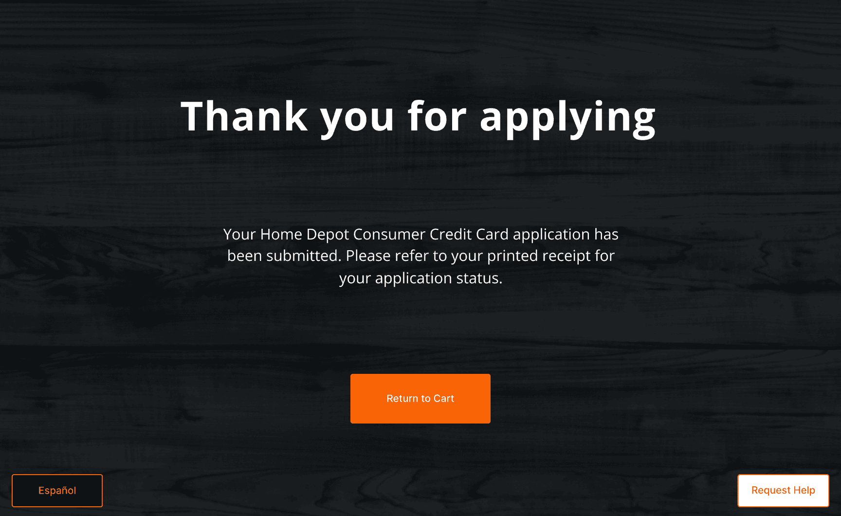
Second-Look Financing at Self-Checkout
When a credit decline at self-checkout was a dead end, we redesigned that moment into a $40M self-serve financing recovery path — built for a fast, public, unassisted environment.

Role
Year
Timeline
Impact
Lead UX
Designer
2024
12 weeks
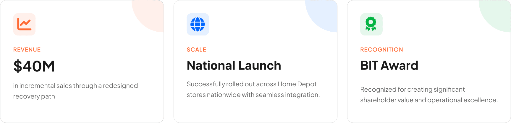
$40M
TL;DR
The short version — if you're in a hurry
Credit declines at SCO had no recovery path — customers hit a dead end
Existing Second Look flows depended on support systems SCO couldn't provide
Key decision: moved T&C review to the kiosk for readability, pinpad only for secure acceptance — keeping checkout fast and compliant
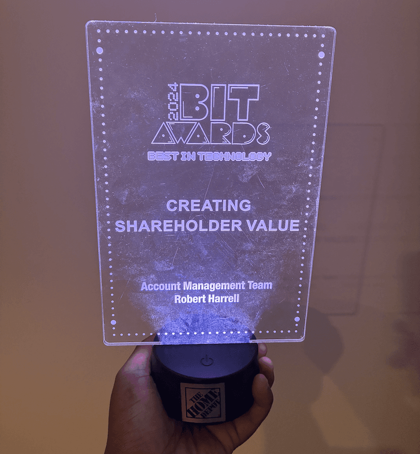
Launched nationally — $40M incremental sales opportunity recovered
**Due to confidentiality, some details and visuals have been omitted. Here are the key highlights.**
01 Challenge
A dead end that cost the business twice
When customers were declined for the primary card at self-checkout, the experience simply ended. They were returned to cart with no recovery path, no alternative offer, and no way to access the sign-up savings that motivated them to apply.
That created two simultaneous losses: customers hit a dead end after investing time in the application, and the business lost a chance to recover financing at one of its highest-traffic channels. The challenge wasn't just to add a recovery screen — it was to understand why no recovery path existed at SCO yet, when it already worked elsewhere.
Before opening Figma, I needed to understand what made the recovery experience work in other channels — and what SCO was missing that would make it fail there.
"The experience simply ended. No recovery path, no alternative, no second chance."
02 Context
This wasn't an invention problem — it was an
adaptation problem
Second Look already existed in other Home Depot credit channels. Auditing those flows showed exactly what made them work: every successful recovery experience had either an associate to guide the customer through it, or a physical artifact — a printed disclosure — to anchor the T&C moment. Those were the support systems that made the flow viable.
Self-checkout had neither. No associate. No printed disclosure. No guided completion. This was not a blank-slate invention problem — it was an adaptation problem with a clear missing piece: SCO needed a way to handle the T&C moment without any of the support systems the other channels depended on.
That insight reframed the entire project. The question wasn't what to design — it was how to replace what the other channels took for granted.

"Every successful channel had an associate or a printed disclosure. SCO had neither."
03 The Process
The audit revealed what SCO was missing
I audited how Second Look worked across other Home Depot credit channels — mapping the full path from decline to acceptance and reviewing every piece of legal content tied to the alternative offer. I combined that with associate interviews and stakeholder input to build a picture of what the SCO environment would and wouldn't support.
The audit surfaced the broader constraint set: Store Operations needed minimal checkout disruption. Engineering needed secure data handling. Legal needed a compliant disclosure path. The business needed revenue recovery at scale. All of those constraints pointed at the same choke point: the T&C moment was the hardest problem in the flow, and nothing in the SCO environment was set up to handle it.
That finding concentrated the design problem. Solving the T&C moment for a fast, public, unassisted kiosk — without an associate, without printed materials — was the project. Everything else followed from that.

"All four constraints pointed at the same choke point — the T&C moment was the hardest problem in the flow."
04 The Key Decision
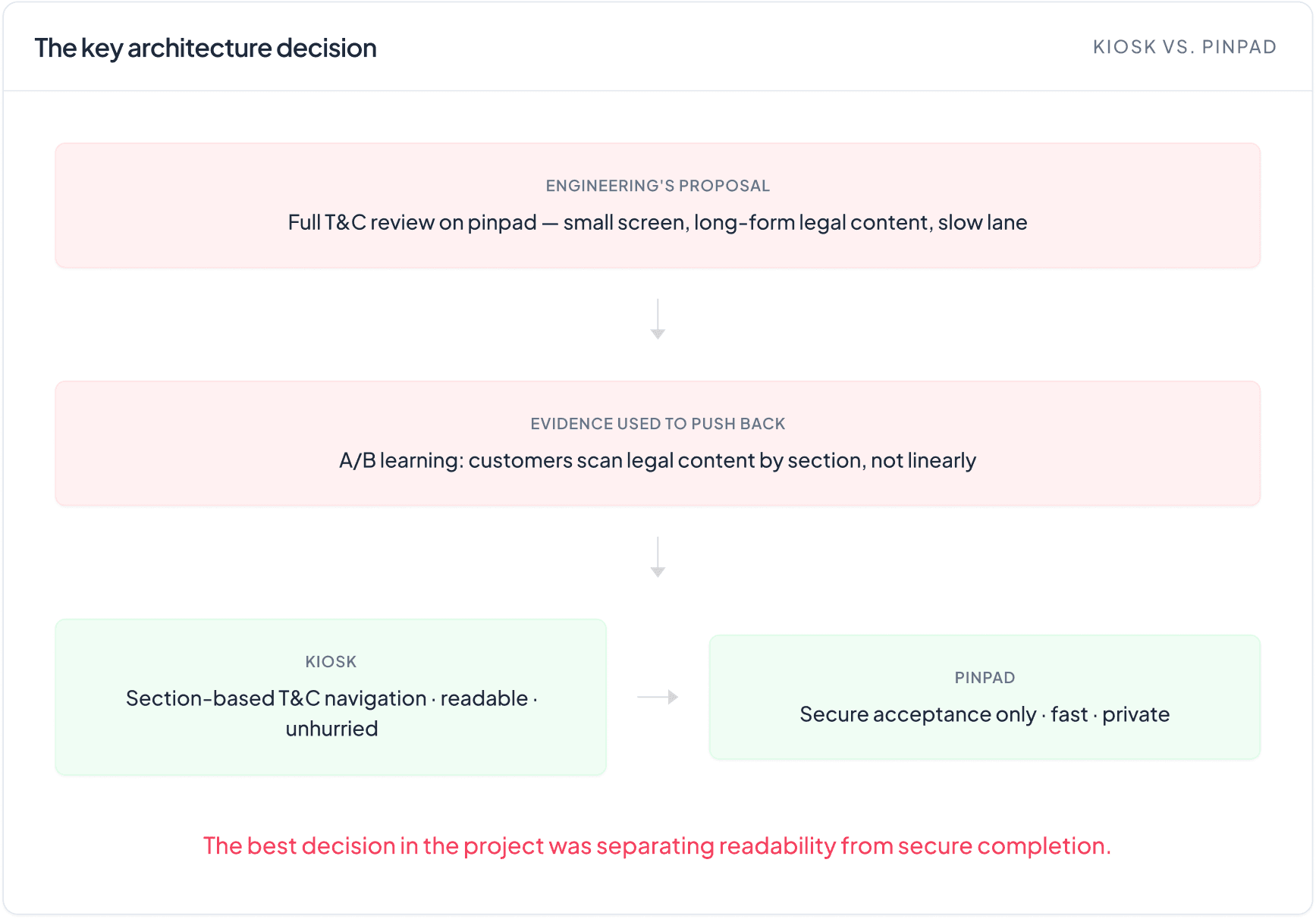
Customers don't read T&C — they navigate it
Engineering's initial direction was full T&C review on the pinpad. I pushed back — the screen was too small for long-form legal content and created two risks simultaneously: a harder reading experience for customers and a slower checkout lane for the store.
The pushback wasn't instinct. During design validation, I watched customers interact with the T&C content and noticed they didn't read it linearly. They skimmed first, identified the sections relevant to them, then dove into those. That behavioral pattern was the evidence — customers needed a way to navigate legal content, not scroll through it.
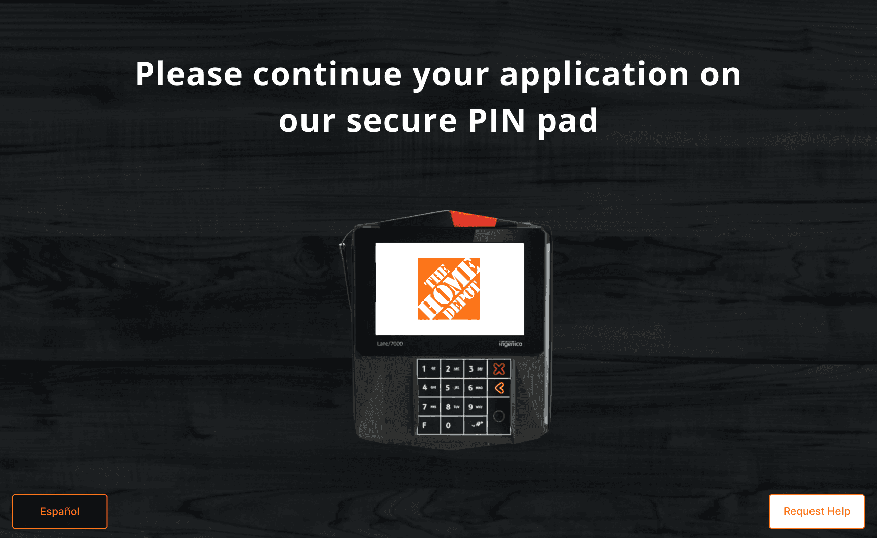
That insight made the architecture clear: the kiosk handles everything requiring reading and decision-making, the pinpad handles only secure input, and the transition between them is designed deliberately. A customer who just got declined needs to trust that continuing on a different device is safe — that handoff moment is not a technical detail, it's a UX problem in its own right.
The solution wasn't just about screen size. It was about giving each device exactly one job, and designing the seam between them.
"Customers didn't read T&C linearly — they skimmed for the section that mattered to them, then dove in."
05 The Solution
Four screens. One unassisted path forward.
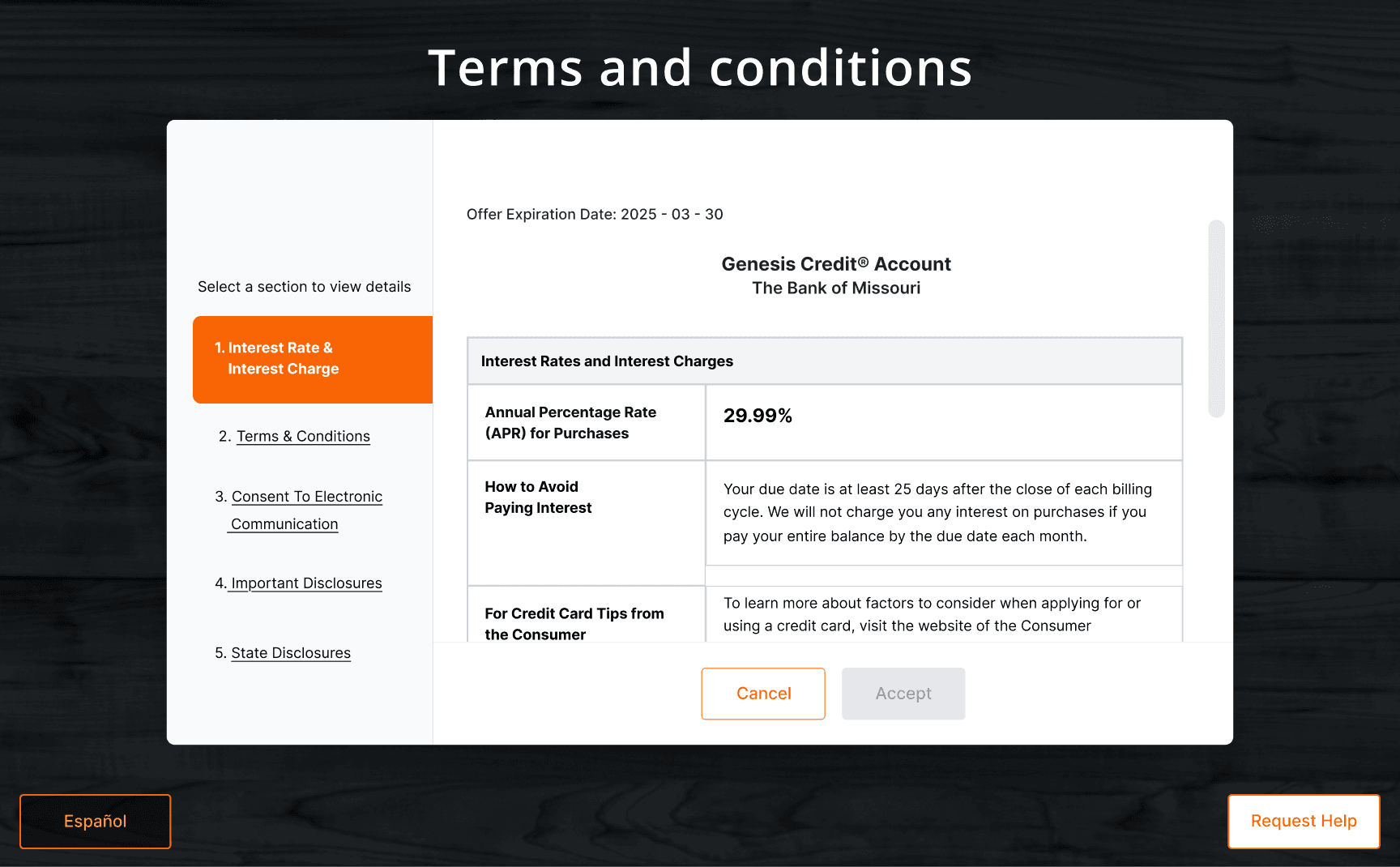
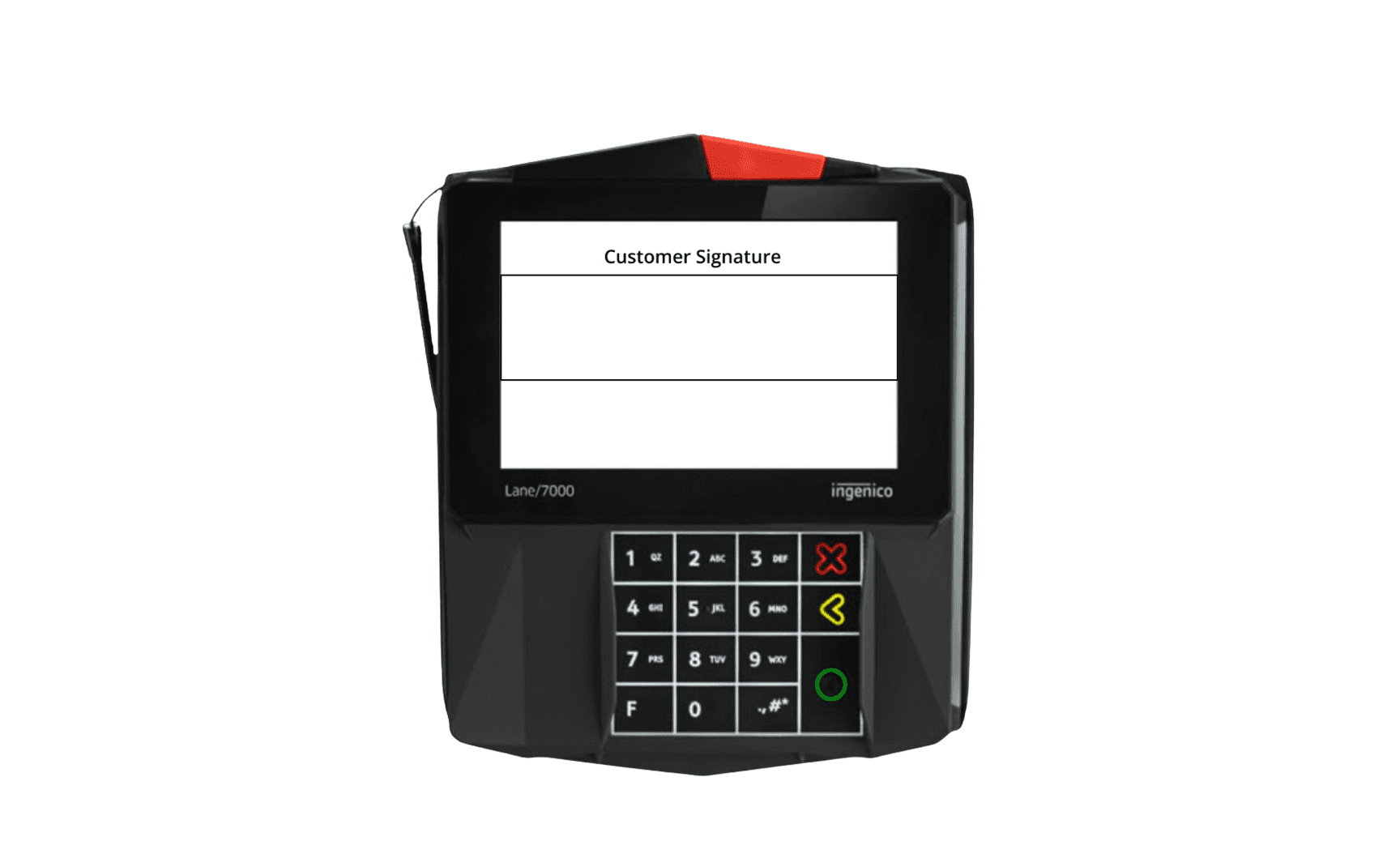
The redesigned flow moves across two devices in four moments: intercept the decline, support T&C review on the kiosk with section-based navigation, hand off to the pinpad, then capture the customer's signature to complete acceptance.
The kiosk handles everything that requires reading and decision-making. The pinpad handles only what it's built for — secure input. That division was intentional: during T&C review, the pinpad is deliberately idle, waiting. The handoff screen bridges the two, managing customer trust at the moment they're being asked to continue on a different device after a decline.
The section-based navigation came directly from what testing revealed. Customers didn't approach legal content the way a compliance team writes it — linearly, cover to cover. They came in with specific concerns, skimmed to locate the relevant section, and read only what they needed. Designing for that behavior — not the idealized one — made the T&C experience faster and less intimidating without changing a word of the legal content itself.
Decline recovery screen— intercepts the decline moment
Kiosk-based T&C review — section navigation for readable legal review
Kiosk —PIN pad handoff
Pinpad — customer signature
06 Incremental Sales
$40M
The redesigned self-checkout recovery flow launched nationally and turned a dead-end decline into a $40M incremental sales — proving that better UX at a high-friction moment creates measurable business value.
07 Learnings
Design for actual behavior, not idealized behavior
The most important thing this project taught me was to audit what makes an existing experience work before trying to adapt it. The channel audit wasn't just background research — it was what identified the actual design problem. Without it, I would have been designing a screen when the real gap was a support system.
The T&C testing finding also stayed with me. Customers don't read legal content the way it's written — they navigate it. That gap between how compliance teams structure disclosures and how real people engage with them under pressure is a design opportunity that almost nobody is treating as one. Designing for actual reading behavior, not idealized behavior, was what made the kiosk solution viable.
In constrained environments — legal, operational, technical — research is as much a tool for influence as it is for design. The pushback on Engineering's direction held because it was grounded in observed behavior, not preference.